The Goal: The goal of this project is to design a personalized mobile tool to support the chronic health journey of Breast Cancer survivors. The idea is to provide adequate yet customized information to the patient based on her stage of diagnosis, treatment plan and several other factors.
Cancer patients face a number of challenges that continue to change throughout treatment and survivorship. These challenges arise the moment these patients are diagnosed. This tool envisions to make this journey easier for them.
Duration : 12 months | Team : 4
My Role : UX Designer, Usability Expert
My Responsibility : Design Ideation and Brainstorming, Competitive Analysis and Study, Creating Initial Mockups, Iterative Design, Visual Design, Interactive Prototyping and Communicating Ideas
My Role : UX Designer, Usability Expert
My Responsibility : Design Ideation and Brainstorming, Competitive Analysis and Study, Creating Initial Mockups, Iterative Design, Visual Design, Interactive Prototyping and Communicating Ideas
Problem Statement
Cancer patients, on diagnosis, deal with not only the magnanimity of being diagnosed with Cancer but also, a plethora of concerns ranging from financial planning to the necessary medical assistance. Not to mention, they need to cope on the emotional and spiritual levels. It therefore, is a very tough time for these patients. To address some of these issues if not all, we envision a smart and temporally adaptive mobile personalized system. This system, informed by existing cancer navigation practices and a holistic cancer journey framework, would present tailored recommendations and resources based on the patient’s diagnosis and treatment plans and would continue to adapt as the user progresses through the treatment.
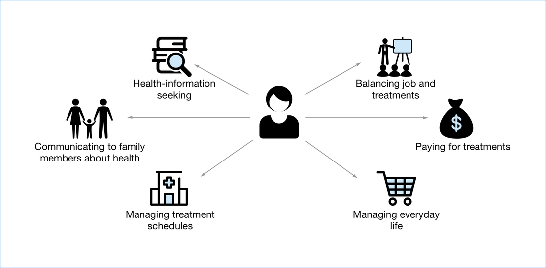
Infographic: Life of a Cancer Patient
Design Ideation and Brainstorming
I started on this project in 2016. It had been in flow for awhile and several studies had been conducted. My role was to take all the learnings and create an interface from it. These designs have gone through several iterations of its design each fed by feedback cycles.
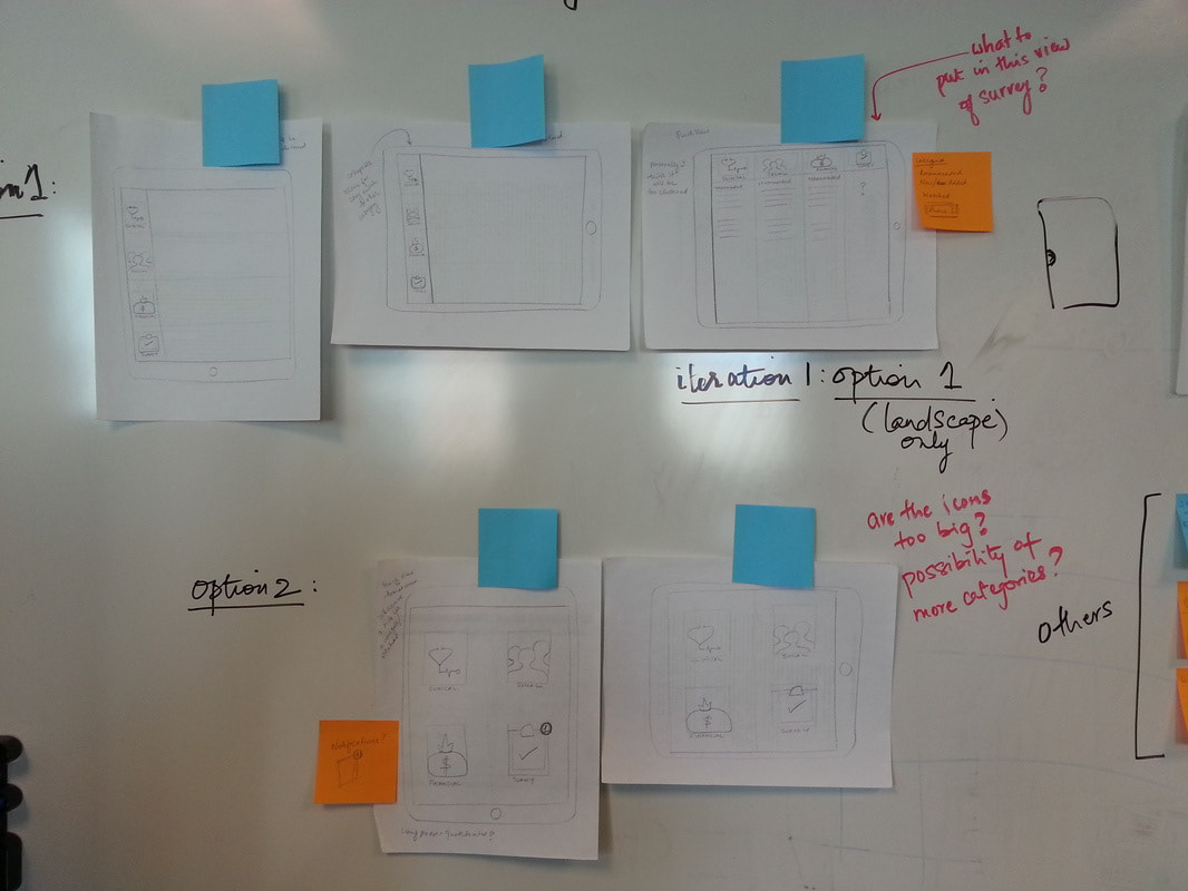
Early Concept Sketches
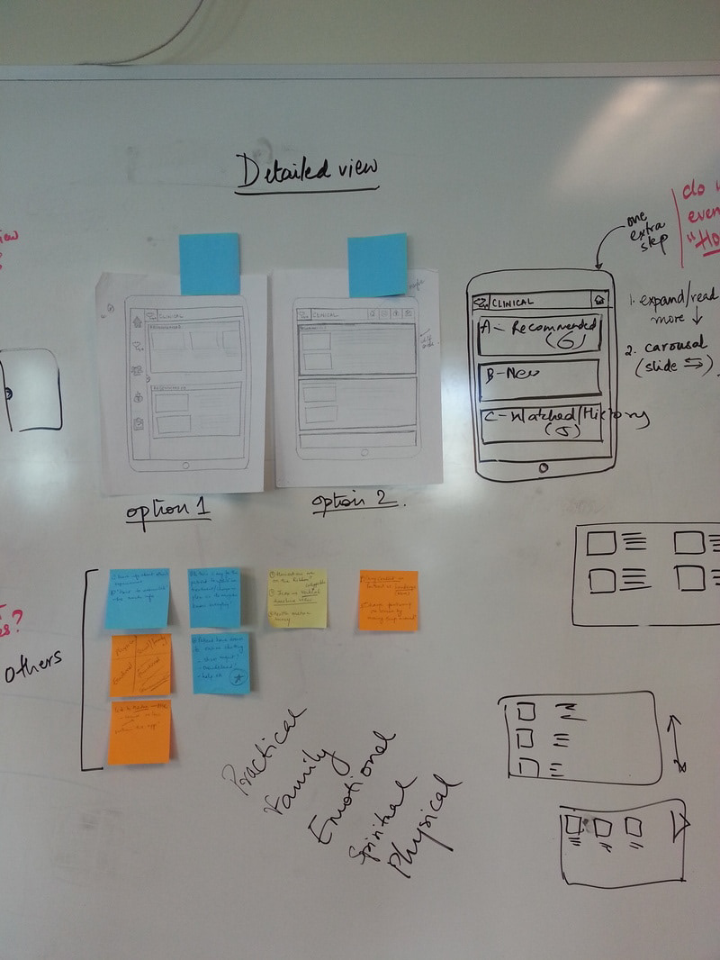
The first round of low fidelity mockups for our interface led the team into an intense brainstorming session wherein we were able to make significant progress as regards our design decisions.
I spent time primarily focussing on the Summary View or the Quick View as well as the Detailed View. I designed two alternatives for each of them. We spent time debating each design and I finally decided to refine it a little more based on the feedback and present the next iteration to a bigger group for further critique and ideas.
I spent time primarily focussing on the Summary View or the Quick View as well as the Detailed View. I designed two alternatives for each of them. We spent time debating each design and I finally decided to refine it a little more based on the feedback and present the next iteration to a bigger group for further critique and ideas.
Early sketches
Early sketches
Early sketches
Medium fidelity
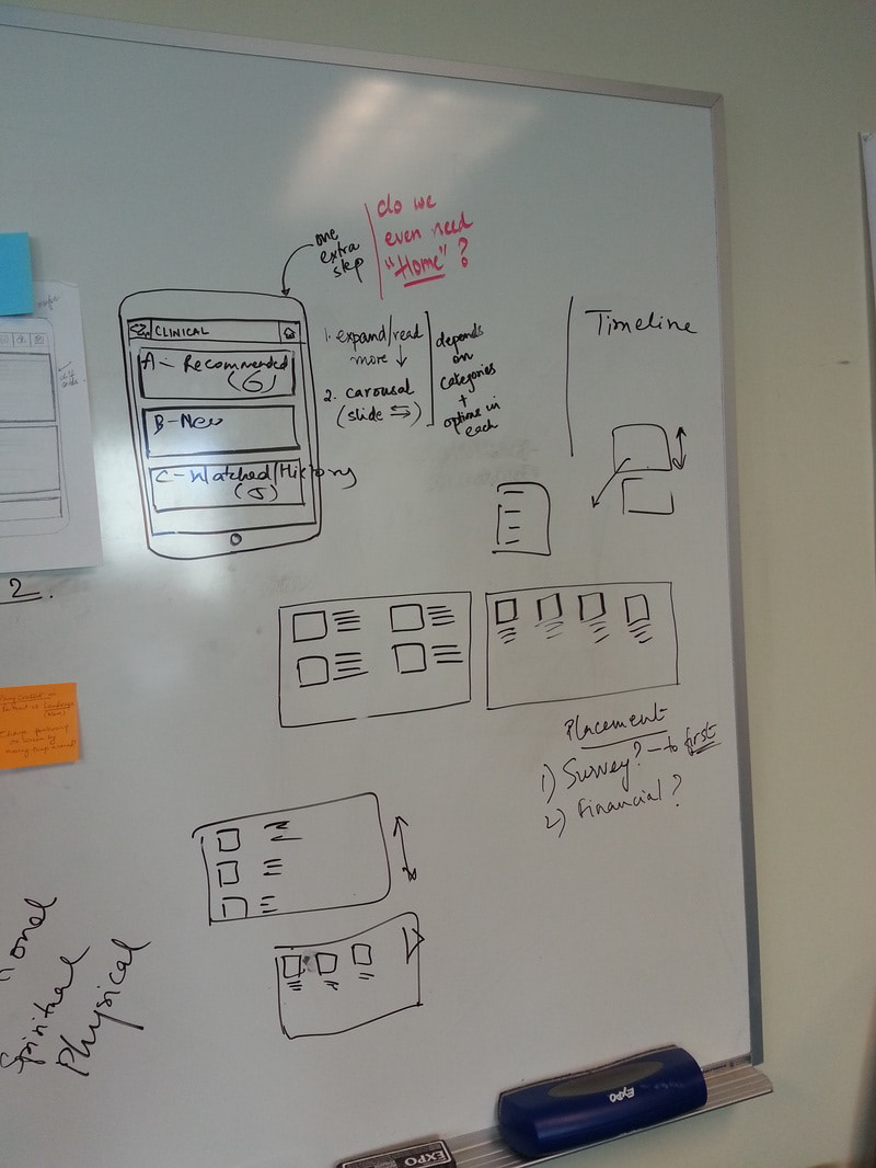
Feedback from iteration 1 gave rise to several questions as I began to understand the space and thus, the needs of my users better. It led to several brainstorming sessions where some of these questions were answered by the team and some were tabled for usability testing.
Challenges
Limited technical capability and comfort: It was certainly a challenge was to come up with a consistent design language that made it easy for the user to associate actions with icons and then learn them over time. I had to constantly remind myself that my user population has limited technical capability including some who may have never used a tablet before. Therefore, information needed to be organized really well and in a manner that was easy to find.
Clutter free screen with big icons: Our pilot study showed that we had users as old as 70 years of age and it was important that we ensured that the design could cater to their needs as well.
Scroll vs pagination: This was one question that we tabled for usability. The team was divided on their opinions on this one so I designed for them both.
Research shows positive messages have an impact on Survivors
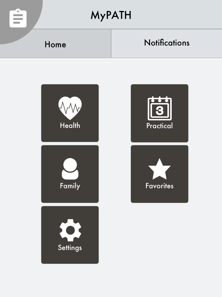
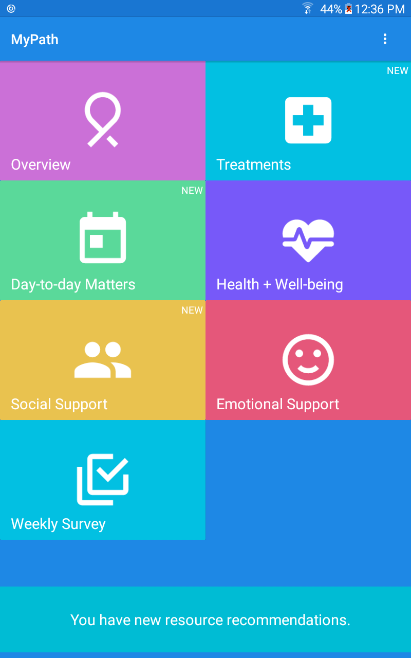
Homescreen with tiles and a red icon as a reminder to take surveys
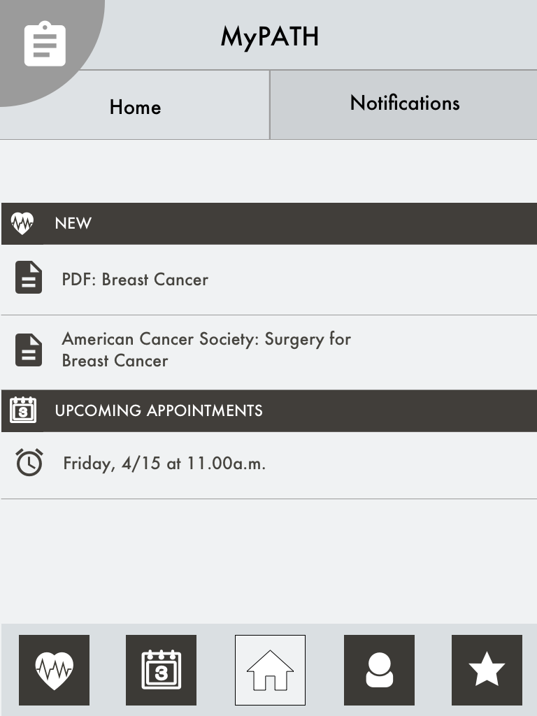
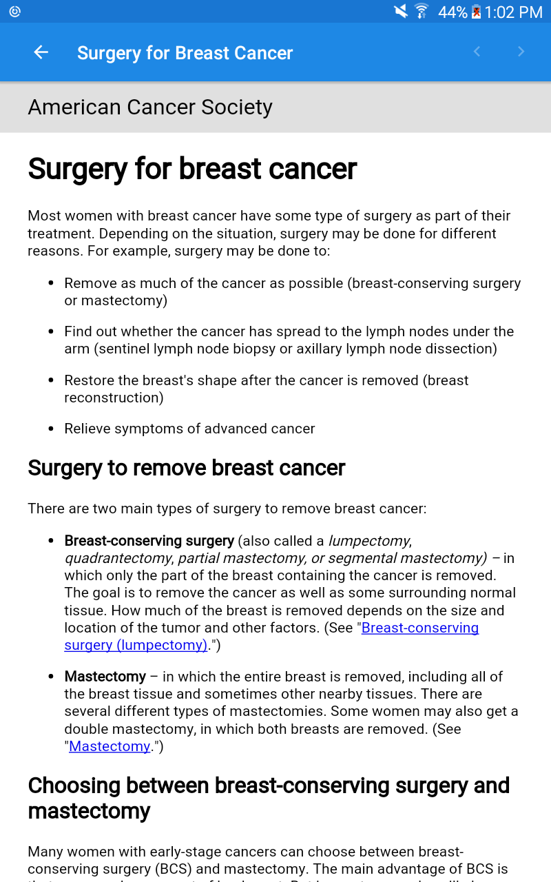
Detailed view
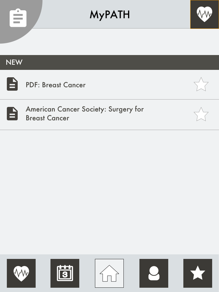
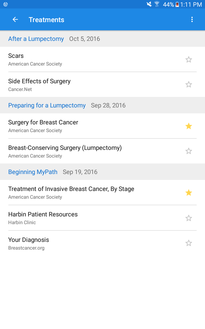
Favorite most visited resource
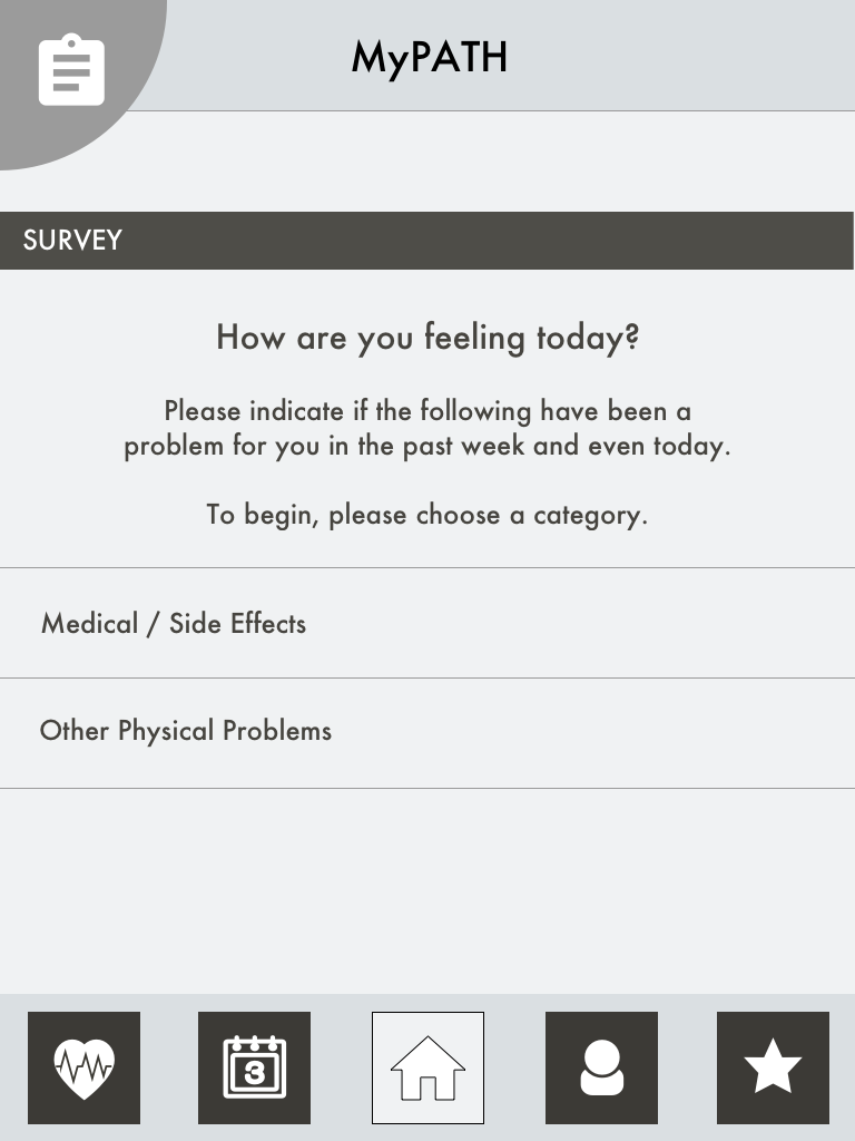
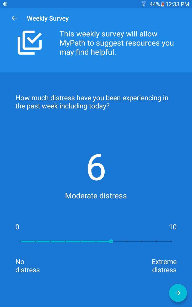
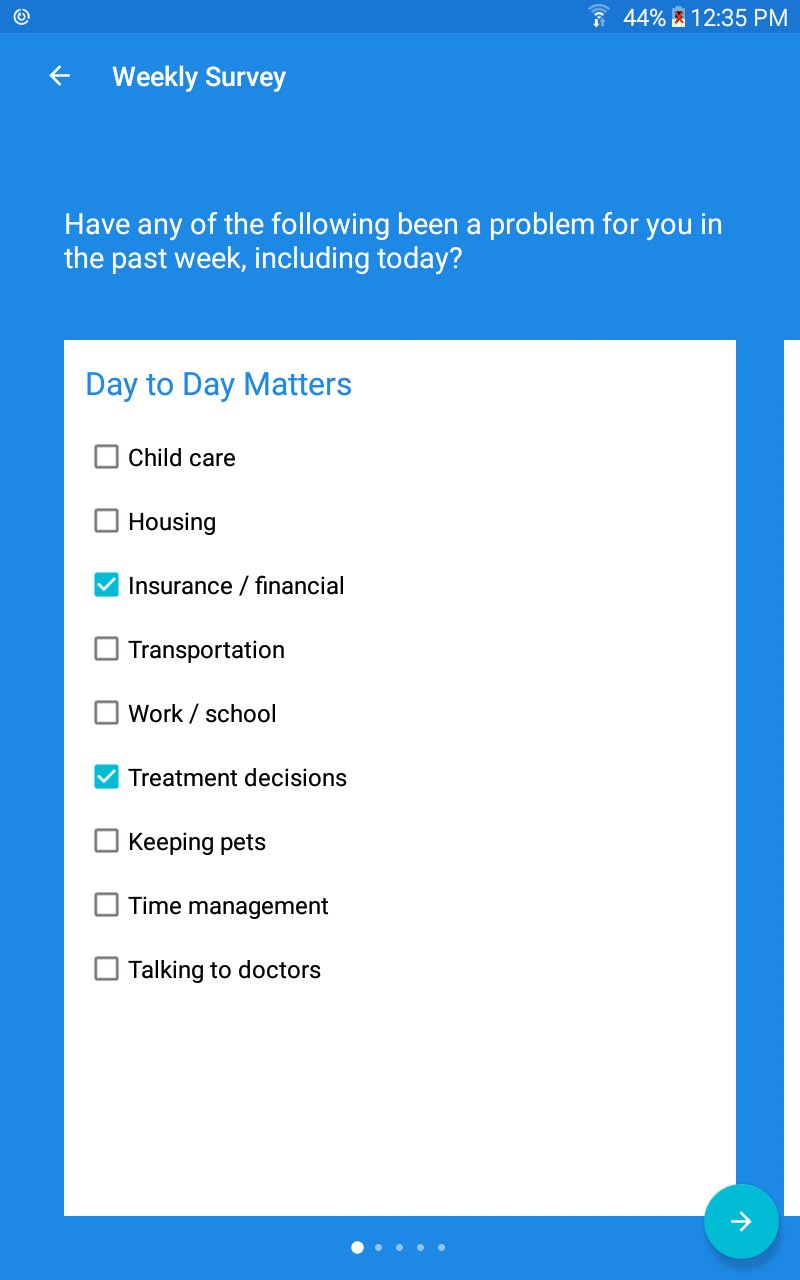
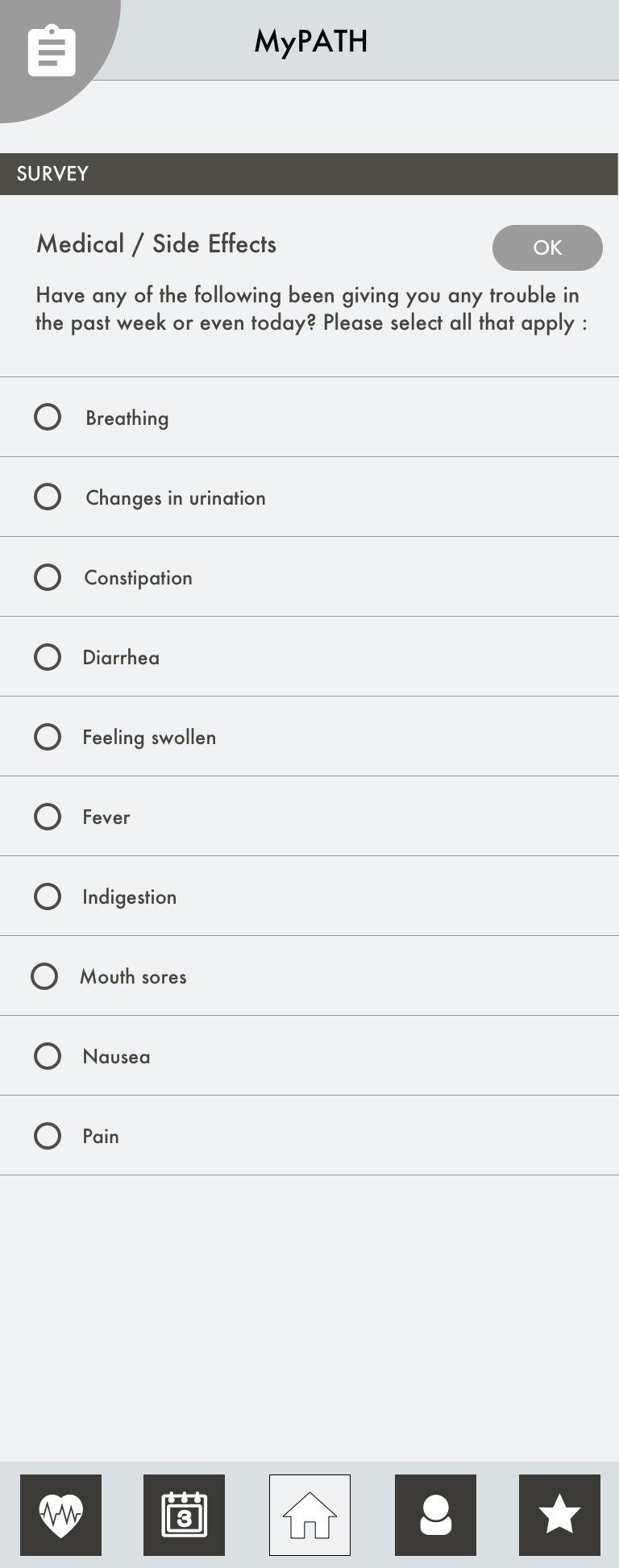
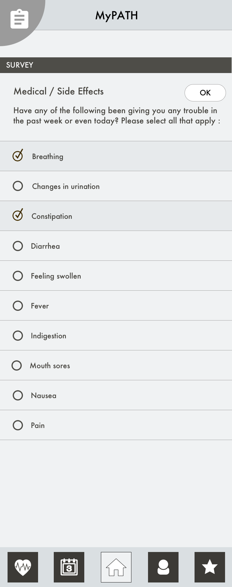
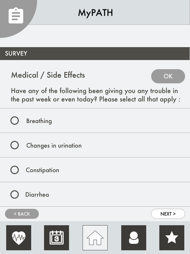
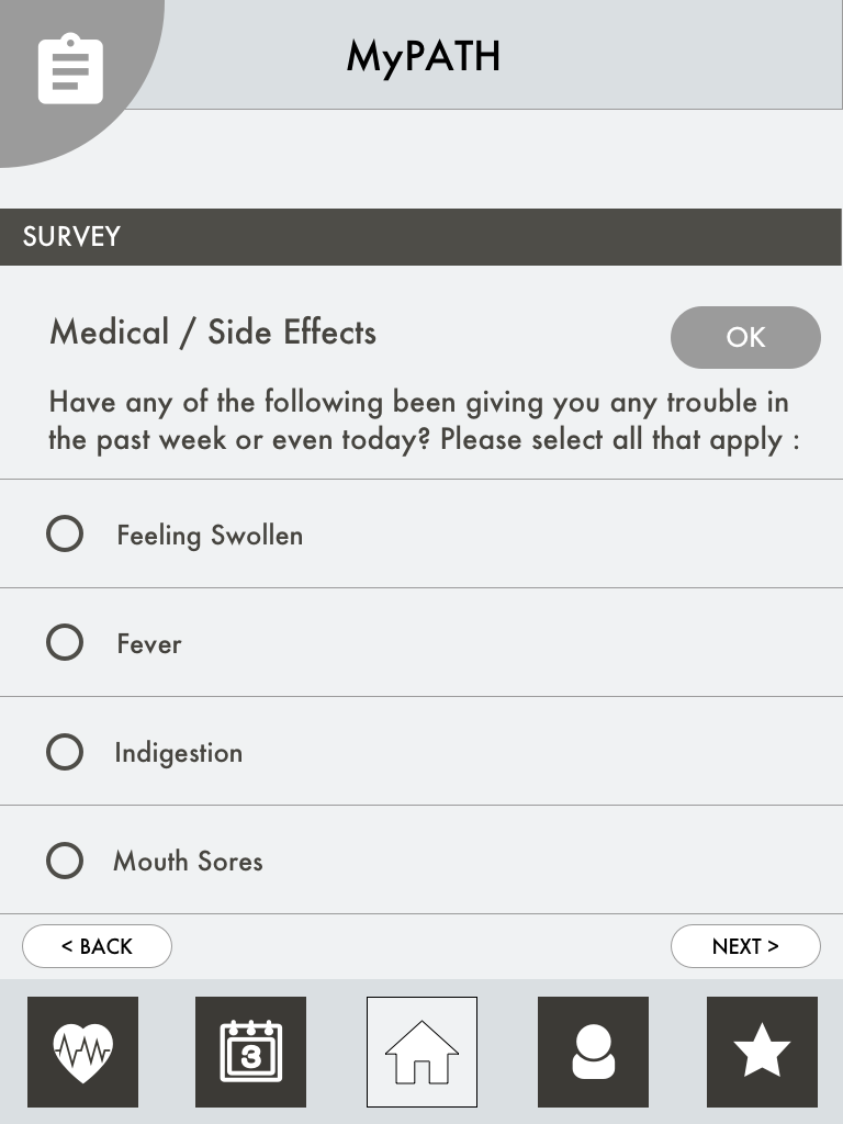
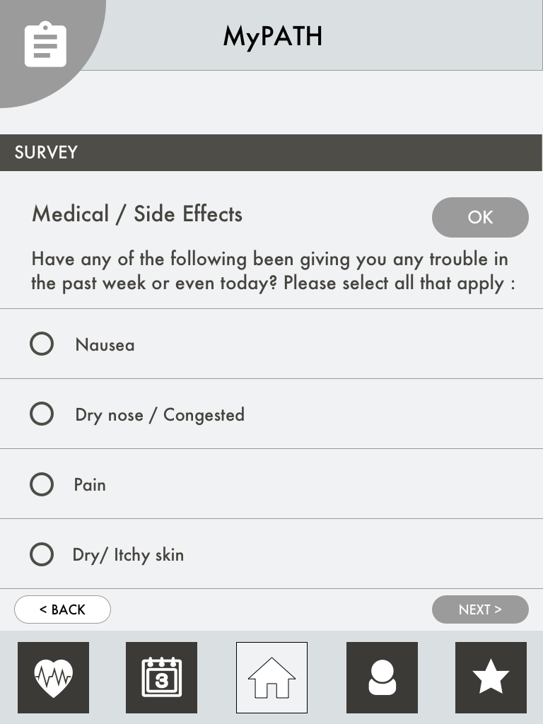
Survey section for Survivors


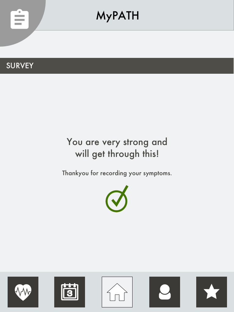
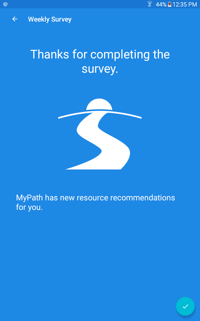
Message at the end of completing a survey
Scroll vs. Pagination
I personally prefer the scroll over pagination simply because to me it seems more intuitive and easy to use as compared to pagination.
However, some members of the team pointed out that I may be making assumptions about the dexterity of the user as well as her knowledge of scroll available as a functionality.
Scroll
Pagination
Visual Language
I tried multiple different potential color schemes and design schemes for this app.
Most of the internal team preferred the Gold theme as it resonated with our school colors at Georgia Tech - "Go Jackets!!"
But having tested it, the most interesting feedback was that the Survivors love that the app is not Pink!
Here is a quick view into my early stage exploration.
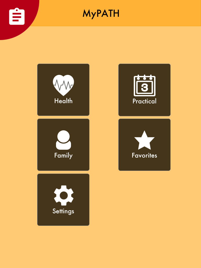
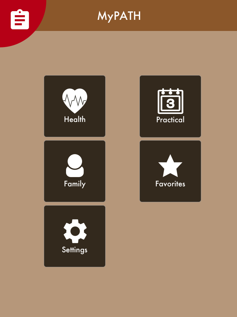
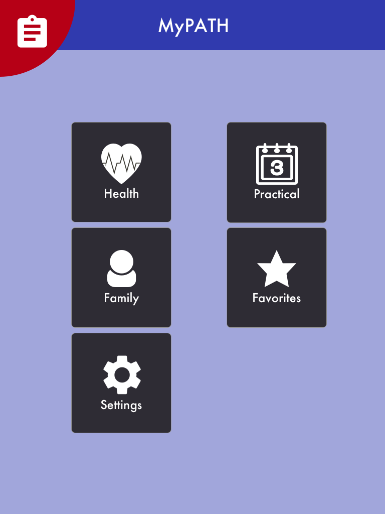
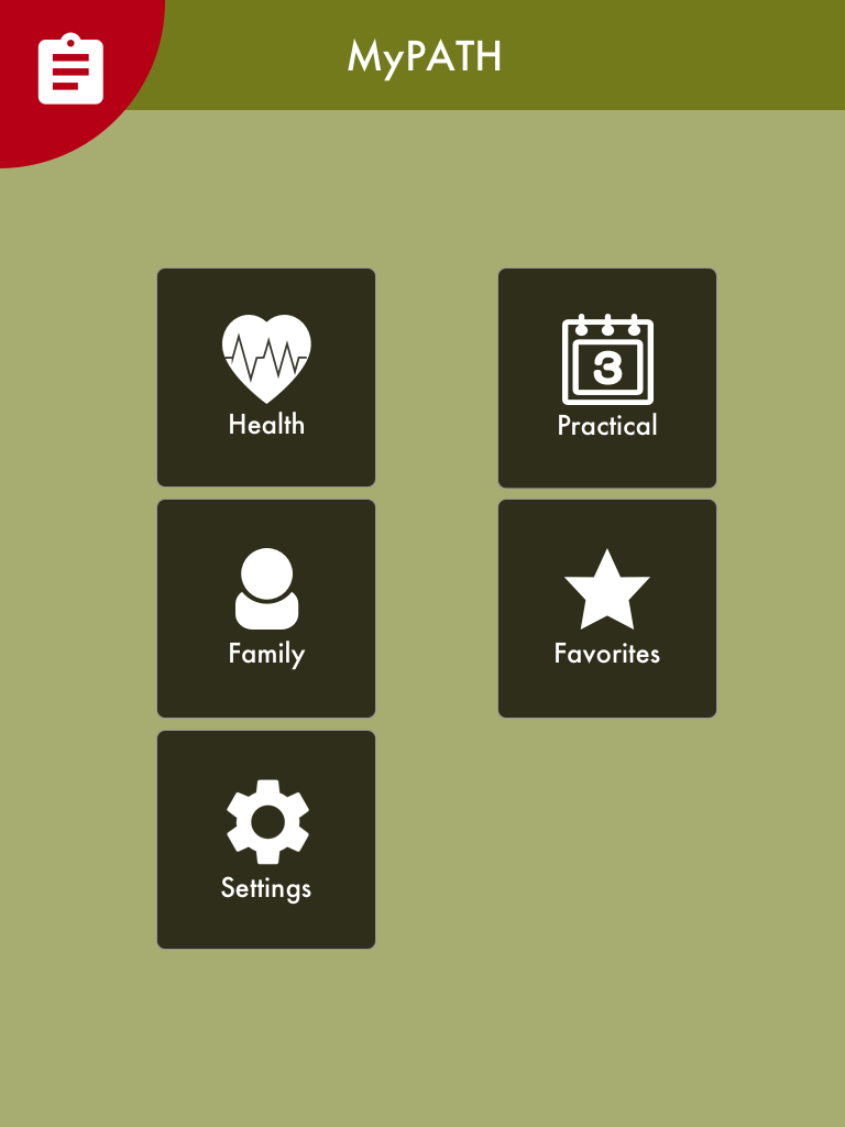
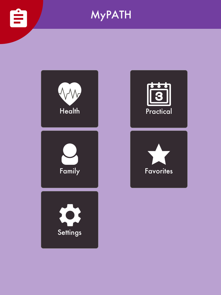
Our users showed a preference towards the Blue.
High fidelity prototypes
A firm believer in the ideology 'Fail often. Fail fast!', we decided to turn this over to our development team to build the app in a quick cycle. While I got the opportunity to work very closely with the development team, I had to make decisions on the fly and sometimes it was a compromise at best.
Challenges
Functionality over visual design: In the interest of time, several little nuances had to be compromised for phase 1. Functionality won over visual design.
MVP: Only the most important features or the ones that required immediate feedback were developed first making for a less than ideal overall experience.
Here's a few screenshots of our app.